


FedEx: When the name shortened itself... and the logo hid its message in the negative space


If you look at the logo FedEx Quickly, you'll often just see a name written in two colors. There's no airplane, no delivery truck, no box, and no obvious symbol telling you that this is a shipping company.
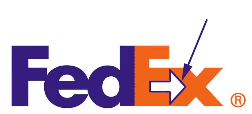
But if you focus a little between the letters E and x, you will discover a white arrow pointing to the right.
And this arrow isn't just a nice move by the designer. To understand why it's there, we have to go back to the story of the name itself.
The story began before FedEx
In 1965, it was Frederick W. Smith a student at Yale University, and he wrote a research paper about a different idea for transporting time-sensitive shipments. Instead of the shipment moving through the traditional transportation network, he imagined an integrated system that combines air and ground transportation, allowing shipments to be delivered very quickly.
The irony is that the research itself received Average rating, but years later, the idea inside it became the foundation of a company that changed the express shipping industry. In 1971, Smith founded his company in Little Rock, Arkansas. (FedEx)
But the most important question for us as a branding story:
Why did he name it Federal Express?
Where did the name Federal Express come from?
Choose a word Federal It wasn't random.
According to the company's official history, Smith considered the word Federal It suggests economic activity across the entire United States, and he was also hoping the name would be catchy for Federal Reserve Bank As a potential customer.
As for Express So it was clear: the service is based on speed and fast delivery.
And thus he appeared:
Federal + Express = Federal Express
A formal, strong name that almost explains the nature of the company from the very first time.FedEx)
And on April 17, 1973, Federal Express began operations from Memphis. On the first night, it had 389 employees and 14 aircraftand quoted 186 shipments to 25 US cities. (FedEx)
But as the years went by, something very important happened that was not decided by the marketing department alone:
People started shortening the name themselves.
People said FedEx before the company said FedEx
Instead of the customer or employee saying:
FedEx
It was easier:
FedEx
Fed Who Federal
+
Ex Who Express
Fed + Ex = FedEx
Abbreviation is faster in speech, shorter in writing, and easier to remember.
And this is a great lesson in naming: sometimes the company chooses the first name, but How people use the name reveals the strongest name to the company.
By the early nineties, the company was working with Landor Associates on the development of its identity. Landor's research showed that the name Federal Express was no longer the optimal choice for a global brand, while FedEx was already being used by customers and employees.Fast Company)
And 1994 The transition has officially taken place:
Federal Express → FedEx
And the company itself records 1994 as the year it rebranded as FedEx. (FedEx)
And this is very close to the lesson we talked about at Dunkin’.
Dunkin’ Donuts has become Dunkin’.
Federal Express has become FedEx.
But in both cases, the company didn't invent a strange new name. It took The part people actually knew him by, and turned it into the official brand.
And then the logo came
Here begins the best part of the story.
With the new name, a new identity was required. The project was under the leadership of the designer Lindon Leader At the Landor office in San Francisco.
The team conducted hundreds of explorations and design experiments before arriving at the final options. Ultimately, six directions were presented to management.Fast Company)
And the final result looked very simple:
FedEx
No icon next to it.
No airplane.
No globe.
No harm.
No way.
Just the name.
But the designer did something smarter.
Look between the E and the x


whitespace between characters E And a letter x Form a complete arrow:
E → x
The arrow is present without being drawn as a separate arrow.
And this is called in design the use of Negative Space, or negative space: the emptiness itself transforms into a visual element with meaning. And the FedEx arrow has become one of the most famous examples of this technique in logo design. (Creative Bloq)
And the best part is that the arrow isn't just a visual puzzle unrelated to the company.
FedEx's business concept is based on:
The movement.
Speed.
Direction.
Point-to-point access.
And moving forward.
So what is the simplest symbol that can combine these meanings?
→
Forward arrow.
And the clever part is that it's not obvious at first.
If they had drawn a big arrow next to the word FedEx, the meaning would have been too direct:
Shipping company = stock.
That's it.
But here you see the name at the beginning.
And after a while, someone tells you:
“Did you notice the arrow?”
Then look closely.
And suddenly you discover it.
And once you discover it, it's very hard to look at the logo again without seeing it.
And that is part of the genius of the idea. Even after decades, discovering the hidden arrow is still a topic people pass along, and the logo is constantly mentioned as a classic example of using negative space.Creative Bloq)
The logo doesn't need to depict the product
For me, this is the most important point in the FedEx story.
Imagine if the designer had thought the traditional way:
We are a shipping company, so let's put an airplane.
Or:
Let's get a moving truck.
Or:
Let's put a box with wings on it.
Any of these designs could convey the meaning of “shipping.”.
But the problem was he was going to explain What does the company do?instead of building The brand vibe itself.
FedEx didn't need to draw an airplane to say it transports things.
I just used space between two letters To say:
We are moving forward.
And that is a huge difference compared to Illustration و Brand Identity.
First, you can explain the service.
The second one makes you remember the company.
Even the name and the logo complement each other
And here, the story is, to me, more beautiful than just “there's a hidden arrow.”.
The name itself was made for it shortcut:
Federal Express → FedEx
This means unnecessary letters were removed to arrive at a shorter and faster name.
And then the logo itself was used Unused space Between the letters to create additional meaning.
It is as if the entire identity is built on the same philosophy:
Fewer elements… but a bigger meaning.
Even the arrow did not need a space of its own.
It exists in the first place Inside the name.
And the colors?
The most famous identity uses purple with orange in FedEx Express, but FedEx has historically used different colors for the second part of the logo to distinguish certain group units and services, while the shape remained FedEx He kept his composure.
And this means that the strongest part of the identity was not color alone.
Their strongest visual asset was:
The shape of the word itself + the relationship between E and x + the hidden arrow.
This is one of the reasons the core identity has been able to endure since its introduction in 1994; the design did not rely on a temporary visual trend.Creative Bloq)
And what is the lesson we can learn from FedEx?
The FedEx story holds more than one lesson for anyone building a brand.
The first lesson is The best name is not necessarily the name you started with.
Federal Express was a very logical name in 1971. But as the company grew globally, FedEx became shorter, easier, and more distinctive. Most importantly, customers were already using it.
So the company listened to the way people interact with the brand instead of forcing people to use the long official name.
Second lesson:
The logo is not required to tell the whole story.
A coffee company doesn't have to put a cup.
And a real estate company doesn't have to put a house.
And a shipping company doesn't necessarily have to provide a transport truck.
Sometimes a very small detail related to the brand's idea is stronger than drawing the whole product.
And the third lesson, and this is the most beautiful one:
Simplicity doesn't mean the design lacks an idea.
At first glance, FedEx looks like just four letters in two colors.
However, behind the four letters, there is a naming strategy, an abbreviation created by the natural use of the name, calculated typography, negative space, an arrow, and a message connected to the company's nature.
And this allows us to summarize the FedEx story in a sentence that is very suitable as a conclusion for the post:
The smart logo doesn’t have to tell you everything... sometimes it's enough to keep the meaning right before your eyes, waiting until you discover it.
Or if you want it tied to the branding we did together:
Dunkin’ taught us that a strong brand can drop a word from its name, and FedEx taught us that a smart brand can add a whole meaning... without adding a single letter.
 العربية
  English